Category Demographics

Demographics of Russia – part 2

From some reason, my original post on this subject (Demographics of Russia | Mystics & Statistics (dupuyinstitute.org)) is the second most popular demographic post on this blog based upon the number of hits (although not as popular as this post: Demographics of China | Mystics & Statistics (dupuyinstitute.org). I suspect that is because the Russian post drew in a number of new readers, who keep using this particular post as their daily entry point to blog. I suspect some are Russian readers.

My concluding paragraph in that post was:

So, during the height of the “we will bury you” era the Soviet Union had a population of about 20% larger than the U.S. Russia now has a population less than half the U.S. (and a GDP of less than Canada). It appears that their population will not be growing very fast and may well continue to decline.

Bloomberg just published a related article that is worth noting: Putin’s War Escalation Is Hastening Demographic Crash for Russia (yahoo.com). The article does point out that population is down to 145.1 million as of August (from 146.9 in 2018 according to my post). It does provide two nice charts are the beginning of the article looking at births and mortality and then the fertility rate (which they are showing at 1.5).

Added to that discussion, over 500,000 young Russians have emigrated from Russian for job reasons (i.e. to keep their jobs/careeers with western firms) since the start of the war, and over 500,000 young Russians have emigrated in the last month to dodge the draft. Those latest group of emigrees may return when the draft ends or the war is over, but regardless, it does appear that Russia is taking at least 0.5 million permanent demographics hit this year in addition to overall decline that has been going on since 2018. It appears that demographic drop will continue. The problem is the long-term economic damage done by declining populations, smaller labor forces, and the costs of a less-productive aging population. Japan is a good warning of what happens with this trend: Where Did Japan Go? | Mystics & Statistics (dupuyinstitute.org)

As I point out in the blog post on “Where Did Japan Go?”:

So, we have seen a political and military challenge after World War II from the Soviet Union. They went from claiming that “We will bury you” (1956) to dissolving (1991). We have seen an economic challenge from our ally Japan, and it certainly impacted our car industry and consumer electronics. This has gone in only two decades from a point where the economic growth trajectory lines of Japan seemed to be on track to surpassing the United States to a point now where Japan’s economy is a quarter of our economy. And…..it still does not appear to be growing much. It makes you wonder about the next political, military or economic challenge…..and how that will play out.

The Demographics of the Last Election

The last three “political” posts referred to the sense that this latest election may be the start of a new period of single party dominance. We the looked at the changing demographics in the United States and then the change of religion. These three posts are here:

Is the United States on the Verge of Becoming a Single Party Democracy? | Mystics & Statistics (dupuyinstitute.org)

U. S. Demographics: Then and Now | Mystics & Statistics (dupuyinstitute.org)

Religion in the U.S. over Time | Mystics & Statistics (dupuyinstitute.org)

So, why does this matter? Well, let us look at who voted for whom in this last presidential election. This is from the CNN exit polls, which while not “perfect,” they are good enough for this discussion:

Race:………………Percent…….Biden…….Trump

White:……………..67%…………41%………..58%

Black:……………..13%…………87%………..12%

Latino:……………13%…………65%…………32%

Asian:…………….04%…………61%…………34%

Other:…………….04%…………55%…………41%


To read the first line:, “white” made up 67% of the 15,590 people polled. 41% of them voted for Biden, 58% of them voted for Trump. 

Religion……….Percent……Biden……Trump

Protestant:……43%………..39%………60%

Catholic:………25%………..52%………47%

Jewish…………02%

Other…………..08%………..69%………29%

None…………..22%………..65%……….31%


Of course, this is an exit poll, so the actual figures may be a couple of percent off, although it is a pretty big poll and exit polls tend to be more accurate than most other polling. The exit poll results are here: https://www.cnn.com/election/2020/exit-polls/president/national-results

Now, there are whole lot of other factors influencing the voter behavior in addition to race and religion but this is enough to look at to establish my point. Now, lets us say we have an electorate that is:

White: 76-19 = 57%

Black: 13%

Asian: 6

Hispanic: 19

Other: 4


Then a Democratic candidate with the same pull as Biden would take 53 percent of the vote (.57 x .41 + .13 x .87 + .06 x .61 + .19 x . 65 + .04 x ..55 = .5289) while a Republican candidate with the same pull as Trump would take 44 percent of the vote (.57 x .58 + .13 x .12 + .06 x .34 + .19 x .32 + 04 x . 41 = .4438). This means that popular vote would split around 53% to 44%, which is a solid and secure lead for the Democratic candidate. In 2020 the popular vote split 51.3% to 46.9%. Turn out in 2020 was 66.7% of registered votes, which is the highest turn out in any U.S. presidential election since 1900 (McKinley vs Bryan). Turnout was below 50% in 1920 (Harding vs Cox), 1924 (Coolidge vs Davis vs La Follette) and in 1996 (Clinton vs Dole vs Perot). Turnout is big issue in the final vote totals, especially as not all age groups and other groups have the same rates of turnout.

So, looking just at demographics is does appear that on the national level the Democrats will continue to hold an advantage of several percentage points over the Republicans unless:

  1. The Republicans expand their reach into the “minorities” votes (Blacks, Asians, or Hispanics). Right now, they are behind in all three, and there does not seem to be strong reason for this to change in the near future.
  2. The Republicans maximize the “white” vote to around 65%.
  3. The demographics of the U.S. changes significantly away from the growing representation of “minorities.” There is no reason to believe that this will happen. 

In fact, most likely that demographics of the U.S. will continue to slowly move to even a larger percent of people identified as minorities. So, if the situation is bad now for the Republicans, it will only get worse over time unless there is a major change. This is part of the reason why I tend to believe that we are looking at an extended period of a single dominant political party. And this is not discussing religion.

But, religion is an issue. We have gone from 1970 to there being only 8% of the population telling Gallup that they are not Christian to 31% in 2017 that do not identify themselves as Christian. Now, it would take a huge cultural shift to change that back. Most likely that 31% will remain the same or get larger over time. If it gets larger over time, then this also works against the Republicans. Going back the exit polls, in this last election 60% of Protestants voted for Trump while 65% to 69% of “other” and “none” voted for Biden. So unless there is suddenly a nationwide religious “revival,” this is not going to get any more favorable to the Republicans in the long run.

So, two long-term trends working against them sort of ensures that more often than not, the Democrats with control the House, Senate and Presidency for many decades to come. And these are not the only long term trends working against them (for example, among voters at 18-24: 65% voted for Biden, only 31% for Trump).

There are a lot of little things that play with the conclusions and overturn them occasionally. This includes who is running for each party, what policies they adopt, which scandals/controversies occur, and probably most important, whether the economy is heading up or down during an election year. But the long term pattern is looking pretty certain. 

Religion in the U.S. over Time

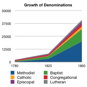
In addition to demographic changes, there also a shift in religious beliefs or lack thereof. The chart below shows the growth in various churched from 1780 to 1860. One will note it is primarily protestants, with Methodists and Baptists dominating. There is a very small line for Catholics. The Catholic areas tended to be where there were Hispanic populations (Texas and California) or where there were Americans of French descent (Louisiana). The state of Maryland was also established as a Catholic colony. During the time of the English Civil War, Catholic Maryland was invaded twice by Virginia, generating one “major” battle (The Battle of Severn in 1655 near what is now Annapolis, Maryland). The Battle of Severn resulted in 2 killed from the 175 Virginian attackers and 49 casualties (17 killed, 32 wounded, with 4 people executed after the battle) among the 130 defenders (38% casualties).

So this takes us up to the U.S. Civil War. The Irish Potato famine started in 1845, generating a large migration of Irish Catholics to the United States. The Irish population declined from around 8.18 million in 1841 to 5.8 million in 1861 and continued to decline to 4.21 million in 1931. The U.S. Irish population boomed. This was followed by many other immigrations from other parts of Europe. By 1950 the split of religions was:

Protestant: 69%

Catholics: 25%

Jewish: 4%

Other religions: 3%

Undesignated: 2% 


As of 2017, the same source (Gallup) reports:

Protestant: 38%

Catholics: 21%

Non-denominational Christian: 9%

Mormon: 2%

Jewish: 2%

Other religions: 5% (Muslims make up around 1%)

None: 20%

Undesignated: 4% 


Some political parties tend to make religious appeals based on Judeo-Christian heritage, but…it appears that around 30% of the U.S. population no longer identifies itself as Christian. This is a significant change. Most of that change started in the 1970s and greatly expanded in the 1990s and is continuing to expand.

Year……Percent not Christian *

1970……8%

1975…..13%

1980…..11%

1985…..14%

1990…..18%

1995…..18%

2000…..17%

2005…..19%

2010…..24%

2015…..29%

2017…..31%


* i.e. Designated Jewish, Other Religions,. None and Undesignated.


The United States has had two Catholic presidents (Kennedy and Biden), three presidents of significant Irish descent (including Reagan who was half-Irish and half-English/Scottish), two of significant German descent (Eisenhower and Trump **), one of Dutch descent (Van Buren, the only president to speak English as a second language ***), one who was mixed race (Obama), none of Italian descent, none Hispanic, none Jewish and none Mormon. 38 of our 45 Presidents were primarily English/Scottish descent and officially protestants.

** Trump is German on his father’s side and Scottish on his mother’s side.

*** Theodore Roosevelt was 1/4 Dutch.

U. S. Demographics: Then and Now

Much of what is driving the political landscape is demographics. In the United States in 1860, just before the U.S. Civil War, consisted mostly of either “white” protestants; “blacks,” most of whom were slaves; and very few “Indians,” most of whom lived on reservations. Obviously slaves could not vote but were all freed in 1865. Women could not vote until 1920. The citizens also could not directly vote for Senators until 1913. Before then, they were chosen by the various state legislatures.

The actual statistics from 1860 were:

Total Population: 31,443,321

“White”: 26,922,537 (86%)

“Black”: 4,441,830 (14%)

“Indian”: 44,021 (0.14%)

“Asian”: 34,933 (0.11%)

“Hispanic”: 155,000 (0.5%)


Indian is American Indian, Eskimo and Aleut. Asian is Asian and Pacific Islander. Hispanic can be of any race and overlaps with the other categories. The “Hispanic” figure is a very much later estimate and is not based upon census data at that time. I gather the other categories are based upon self-identification (or visual identification by census takers). 

Now step forward to 1930, towards the end of the period of Republican domination:

Total Population: 122,775,046

“White”: 110,286,740 (90%)

“Black”: 11,891,143 (10%)

“Indian”: 332,397 (0.27%)

“Asian”: 264,766 (0.22%)

“Hispanic”: 2,021,820 (1.6%) – figure from 1940


The “Hispanic” figure is a later post-census estimate.

Also the nature of the “white” population had changed, and that is a long discussion that I will avoid. It was no longer mostly Anglo, but included considerable number of people from or descended from Germany, Ireland, Italy, various Eastern European countries, etc. This immigration also brought in a considerable number of Catholics and Jews. Some of these groups also faced some discrimination.

And then we get to 1980, towards the end of the period of Democratic domination:

Total Population: 226,545,805

“White”: 188,371,622 (83%)

“Black”: 26,495,025 (12%)

“Indian”: 1,420,400 (0.6%)

“Asian”: 3,500,439 (1.5%)

“Hispanic”: 14,608,673 (6%)

“Other”: 6,758,319 (3%)


And to move up until today (2020, projected) – the end of what may be the period of contested control:

Total Population: 333,896,000

“White”: 255,346,000 (76%)

“Black”: 44,810,000 (13%)

“Indian”: 4,328,000 (1.3%)

“Asian”: 19,708,000 (6%)

“Hispanic”: 63,784,000 (19%)

“Two or more races”: 9,703,000 (3%)


So, Latino’s, other minorities and mixed race people now are up to 42% of the population. In 1980 it was 23%. This is a significant change, especially if one political party does better with some of these groups than others. 

It is clear that this shift is having a big effect on U.S. politics. Of course, that is saying the obvious, but this is a major driver in why I think one party is about to re-establish dominance. 

U.S. Population Growth for 2019

The U.S. population grew 1.5 million in 2018 up to 328 million. This is around 0.5% growth rate. Over a third of that growth was immigrants.

Immigration in 2019 was 595,000 people, down from around 1 million in 2016. Guessing this refers to legal immigrants.

This is from an AP article: With births down, U.S. had slowest growth rate in the century

This is all related to our various discussions on demographics:

Demographics of the United States

For those following this subject for political interest, the projected votes swings by state after the 2020 census will be:

“Blue” states (tend to vote Democratic):

California – 1 representative and electoral college vote

Colorado: +1

Oregon: +1

Illinois: -1

Minnesota: -1

New York: -1

Rhode Island: -1

Total =  -3


Swing states:

Florida: +2

Michigan: -1

Ohio: -1

Pennsylvania: -1

Total: =  -1


“Red” states (tend to vote Republican):

Texas: +3

Arizona: +1

Montana: +1

North Carolina: +1

Alabama: -1

West Virginia: -1

Total =  +4


Anyhow, we tend to avoid “politics” on this blog, but these changes are worth noting.

The Population Situation in 2050

I got into doing posts on demographics on a whim. It was not something The Dupuy Institute or I have ever studied in any depth.

Still, it is hard not to notice that it is going to have a long-term impact on the world over the next decades. A look at the situation in 2020 vice 2050 shows the impact (population figures in millions):

………………………………….2020……………………….2050
United States…………………334…………………………389
China…………………………1,403………………………1,348
India…………………………..1,389………………………1,705

Russia………………………….143………………………….129

Japan…………………………..125………………………….107
Germany………………………..80……………………………75


Asia…………………………..4,598…………………………5,267
Africa…………………………1,340…………………………2,478
Europe…………………………740……………………………707

Latin American………………667……………………………784

     and Caribbean

Northern America………….371……………………………433

Oceania…………………………42……………………………..57


All these figures are from the website: https://www.populationpyramid.net/japan/2050/

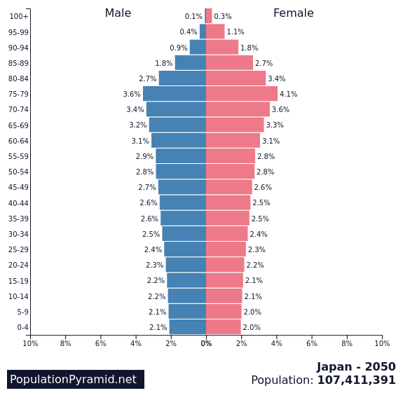
Now, that site nicely also provides a population pyramid for each nation. One of the most unbalanced cases is Japan in 2050, where the population has been in decline since 2010:

In this case you have 46 million people age 60 or over, and only 44 million people between the ages of 20 and 59. Is this an economically sustainable scenario? It only gets worse over time. Does 80 become the new 30?

An older post on the same subject:

Population Now versus 2050


U.S. Fertility Rates

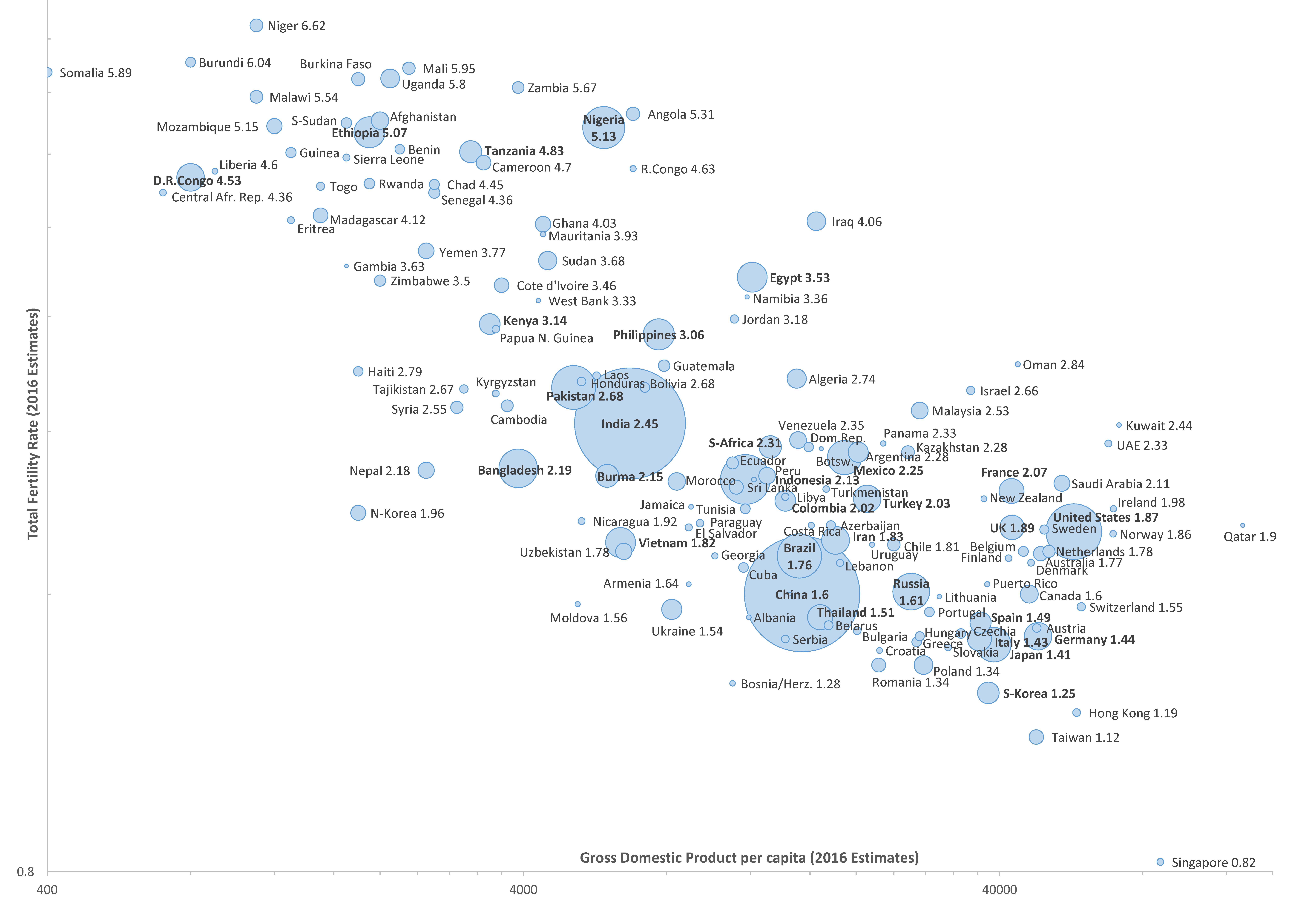
Total Fertility Rate vs. GDP, 2016 estimate (bubble size indicating population size). Source: CIA World Fact Book

Spotted this article that reports that U.S. fertility is the lowest it has been in 32 years: https://www.cnn.com/2019/05/15/health/us-birth-rate-record-low-cdc-study/index.html

The article reports a rate of 1,728 children per 1,000 women, or 1.728 per woman. This is 3.79 million births in 2018. For obviously reasons, replacement rate needs to be more than 2 kids per woman, usually assumed to be 2.1 (which is the figure used in the article, but I don’t know what the actual replacement rate figure is).

So, this is a shortfall of 0.372 children per woman. Now, how significant is such a shortfall? Well, we need a rate of 2.1 and we are getting 1.728 so 2.1/1.728 = 1.215 times the 3.79 million births = 4.61 million births needed. So 4.61 – 3.79 = 820,000 new people needed each year (there is probably a more sophisticated and more correct calculation out there).

The alternative is this scenario:

Demographics of Japan

Where Did Japan Go?

Demographics of China

Demographics of Russia

Therefore, it looks like we have to accept at least 820,000 immigrants a year to maintain status quo. There are a lot of economic reasons why this is probably needed and I don’t know a whole lot of people who dispute this. This of course, assumes the birth rate remains constant and right now it is declining, Currently, the U.S. accepts 1.2 million legal immigrants a year (2016). It appears that the United States receives around 300,000 “permanent” illegal immigrants a year (see this blog post):

Demographics of the United States

With 1.3 to 1.5 million immigrants coming in each year, this means we do have a 500K – 700K surplus, which will cause the U.S. population to grow. There is also a certain number of people that migrate from the U.S. The U.S. population growth rate is currently around 0.8% a year.

On the other hand, I am sure some businesses and economists would argue that the United States needs a positive immigration flow to maintain and expand the labor force and to expand the economy. I am not sure of the specifics of this, but there certainly has been work published on this.

I am very much out of my lane here, in that I have not invested any significant time in examining these issues. I am sure there are more rigorous calculations efforts out there. But still, it does indicate that the U.S. does need to maintain over 800,000 migrants a year to sustain its population, and probably several hundreds of thousands above that to maintain its labor force and economic growth.

Population Now versus 2050

The Afghan Insurgents

Suicide bomber in Baghlan Jadid, April 2009. Photo by William A. Lawrence II

The charts looking at force ratios created by our regression analysis of 83 cases were very much based on insurgent cause, a subject that a lot of counterinsurgency analysts gloss over. The question is whether the insurgency is based upon a central political idea (like nationalism), an overarching idea (an ideology like communism) and a limited developed political thought (a regional or factional insurgency). This very much changes the difficulty of suppressing the insurgency. It also changes the odds of winning. The force levels and sometimes duration of insurgencies were significantly different for these cases. In my book America’s Modern Wars I end up spending three chapters on this subject: Chapter 4: Force Ratios Really Do Matter, Chapter 5: Cause Really is Important and Chapter 6: The Two Together Seem Really Important.

Now, this came up when we were doing our estimate in 2004 of U.S. casualties and the  duration of an insurgency in Iraq (which is in Chapter 1 of my book). In this case we have a country that was maybe 60% Shiite Muslim and an insurgency that was centered around the population of around 20% Sunni Muslim. Was this a regional or factional insurgency? Probably. We built that estimate on only 28 cases (because, you know, research takes time). In those cases that were based upon a central political idea, the insurgents won 75% of the time. In those cases that were based upon a limited political idea, the insurgents did not win in any of those cases. This is a big, and very noticeable difference. It was the one bright spot in my briefings (as people weren’t too excited about my conclusions that we would loose 5,000+ and it would take 10+ years…as that was not what was being promised by our political leaders in 2004).

The challenge is sorting out which applies to Afghanistan. There is no question that when they were fighting the Soviet Union, it was based upon a central political idea (nationalism). The question is, what is this insurgency based upon?

Part of the problem in sorting out what is happening in Afghanistan is that the country’s demographics are very complex. For example 42% of the population is Pashtun, 33% is Tajik, 9% is Hazara (who are usually Shiite Muslims), 9% are Uzbek, 4% Aimek, 3% Trukmen, 2% Baloch and 4% others (source World Factbook, 2013 estimate, courtesy of Wikipedia).

Language is a little better with 80% speaking Dari, which is Persian or Farsi. 47% speak Pashto, the native tongue of Pashtuns. 5% speak English.

The country is usually considered 85-90% Sunni Muslim and 7-15% Shiite Muslim.

A 2018 population estimate for Afghanistan is 31,575,018 (pretty precise for an estimate).

The insurgents tend to also be separated in a bewildering array of groups (as was also the case when they were fighting the Soviet Union). Some of the insurgent groups are:

Taliban: These are the previous rulers of Afghanistan. Was close to Al-Qaeda.

Haqqani Network: Offshoot of the Taliban. Al-Qaeda affiliate.

Fidal Mahaz: Splinter group from the Taliban

IEHCA: Splinter group from the Taliban

HIG: Gulbuddin Hekmatyar group, who has been doing this since 1980s. He signed a peace agreement with the Afghan government in 2016.

IMU: Originally an Uzbek movement.

Islamic Jihad Union (IJU): Militant Islamist organization. Split off from IMU. Al-Qaeda affiliate

ETIM: Uyghurs from China.

LeJ: anti-Shiite group

Pakistani Taliban or TTP: Primarily focused on Pakistan

Lel: Primarily focused on Pakistan

ISIL-KP: Islamic state affilliate.


This is a quickly cobbled together list. Some with more expertise are welcome to add or modify this list.

Wikipedia does give strengths for some of these groups. Have no idea how accurate they are:

Taliban: 60,000

Haqqani Network: 4,000-15,000

Fidai Mahaz: 8,000

IEHCA: 3,00-3,500

HIG: 1,500-2,200+

al-Qaeda: 50-100


So….when I was coding the over 100 cases that we now have in our database, it was relatively easy to determine if an insurgency was based upon a central idea, or an overarching idea or was regional or factional. There was very little debate in most cases.

On the other…..it is a little harder to tell what it should be in this particular case.

Interesting enough, I stumbled across an article last week discussing the same issue: https://nationalinterest.org/feature/taliban-and-changing-nature-pashtun-nationalism-41182

Population Now versus 2050

As you may have noted in my previous demographics posts, I was tracking the population of the various nations I was looking at, both in 1950, currently and the estimated for 2050. Let me summarize briefly what we are looking at (measured in millions of people):

                                       1950                    2017                    2050

China                               583 (1953)         1,411                   1,360

India                                 361 (1951)         1,324                   1,700

United States                   151                       309  (2018)          402

Soviet Union/Russia        182  (1951)           143  (2018)          132

Japan                                83                        127                       109

Germany                           69                          83                        79


Now, a lot of numbers there. Let us set the U.S. at a value of 1 and everyone else at a value relative to it. So:

                                       1950                     2017                    2050

China                               3.86                     4.57                      3.38

India                                 2.39                     4.28                      4.23

United States                  1.00                     1.00                      1.00

Soviet Union/Russia         1.21                       .46                        .33

Japan                                 .55                        .41                        .27

Germany                            .46                        .27                        .20


So, during the height of the bad old days (1950s), the Soviet Union had more population that the U.S.; and China, part of the communist bloc and actually in a hot war with us, had four times the population. Now….well the Soviet Union is gone. In 2050,  China will only have three times the U.S. population while a number of major powers (like Japan, Germany and Russia) will be a smaller fraction of the U.S. population.

Again, I note that some people like to talk about America in decline on the world stage. I really don’t see it economically or demographically.

U.S. versus The World (GDP)

Of course, the real challenge would be predict GDPs in 2050. Probably can with the U.S. On the other hand, it is pretty hard to say where the Chinese economy will be in 2050. I would be hesitant to do a straight line estimate.

U.S. versus China (GDP)

U.S. versus China (GDP)

Right now (as of 2017) the U.S. GDP is $19.391 Trillion according to the World Bank. The Chinese economy is $12.238 Trillion. This is 63% of the U.S. economy. No economy has been that close to the U.S. economy since Japan leading up to 1995.

It is a rather amazing growth on the part of China. Back in the bad old days, after we had fought a war with them over Korea, they were threatening to invade Taiwan, they were supporting North Vietnam against our ally South Vietnam, and allied with the Soviet Union as part of the Communist Bloc, the difference was much greater. The U.S. GDP in 1960 was 543.3 Billion, while China’s was 59.716, meaning the U.S. economy was 9 times greater. Now it is only 1.6 times greater.

Of course, the two economies are intertwined, with the United States being China’s largest trading partner. This sort of leads to the odd situation where some in the U.S. and China consider the other to be a rival. But, I can’t think of too many cases where major trading partners were opposing hostile players on the world stage. Still, it is a very uncomfortable arrangement with the U.S. nominally the leader of the free world, while China had been known to run over its people with tanks. They are still very much a dictatorship. So the two nations seem to exist as trading partners who are not really friends and not really enemies. They may be rivals in the long run, or may not. There is, of course, an on-going trade dispute between the two nations.

Now….if were extend those lines on the graph out…..it does look like they will cross at some point around 2050 or so. This of course, leads me back to this post:

Demographics of China

It is projected that by 2050 the Chinese population will decline to 1.36 billion by 2050 (it is currently 1.41 billion) while the U.S. will grow to 402 million by 2050 (it is currently 328 million). For a number of reasons, I don’t think we will see the Chinese economy exceed the U.S. economy by 2050.